Happy day all! Thanks to the feedback of folks in the BitD community, I’m happy to report that my BitD Virtual Play Tookbox is out of beta and open for any to use for free.
I created this toolbox to solve a few problems that my table experiences, namely that I hated flipping from screen to screen and needing a lot of clicks to get what I needed from Roll20 or other solutions I’ve tried.
The key benefit of this Toolbox over other tools I’ve used if it can display up to 8 PC character sheets side-by-side, making it much easier to see who’s contacts / special abilities / equipment / etc can help in the current situation. Now you can see key progress clocks, stress, and other key info for the whole crew all on one screen! No more clicking through loads of windows or setting up custom rollable tables and using the hacky way of indicating how full the clock is!
Other features:
All-in-one so you don’t need much of anything else: contains PC & crew sheets, faction tracker, safety tools, a way to see all the key clocks for your game, and integrated BitD-specific die roller!
Character sheets are smart to save you time: pick your playbook and the right information auto-populates. Check a checkbox and the item glows green to help it stand out. Load is automatically tracked.
Hello!
I am happy to see how far this project has gone.
I shall use this later today in a session, so more feedback might come later.
For now, first I wanted to say how ingenious this sheet is.
Before I only played around with a bit, but since I am moving the information from Roll20 to the sheet, I saw in more depth it’s inners working. Using unicode with a switch for the character’s action rating was top notch!
For some small feedback:
Skirmish is mistyped as “Skermish”
I believe it would make more sense for the playbook XP to be just one column above the skills, instead of after the coins.
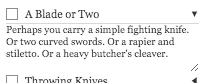
Would it be possible to add extra information for itens? Just like how you can “dropdown” the item in roll20 to get some details (see image below), maybe you could add a tooltip to the cells? (Same thing for crew upgrades)
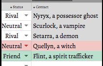
There’s a bug with either the PC 5 contacts that they are not color coding correctly:
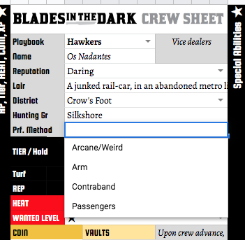
Crew’s preferred method, specific upgrades and contacts doesn’t seems to change (it’s always the smuggler’s).
As for adding more info / tool tips… I don’t know a way to populate tool tips via formula, so I’m stuck there. If anyone knows a truck, that would be great.
RE moving the playbook XP, why is that spot more attractive for you? Its current location is so that lots of the same things can all be found in the same tight area. But that might not be the best idea! Thanks again!
I looked into what it would take to add the “tool tips” for items (very cool idea by the way). It would require adding google app scripts to the sheet - something beyond me technically right now :(. Alas!
v7 is now live. It added an improved cheat sheet (inspired by the Alexandrian’s) and a NPC Names tab containing 100s of names, listed by heritage and presented gender.
Oh snap, I thought I had already answered you, my bad.
I think the playbook XP should be closer to the special abilities, maybe just after the “special” dropdown. It would also make it easier to check all the xp at the same time, so you can decide on which to improve.
Gave a quick look at V7 and seems nice. it will probably take me some time to use it again (my group only plays about once a month), but I will provide my feedback when it comes to it.
Thanks @Rattman! I get it now and yup,that makes a load of sense. I’ve updated the template to have Playbook XP just above the Action ratings, so all XP tracks are closer together. Also modified the harm boxes to glow light red if anything is written in them, making it easier to notice harms. Thanks!!!
I am BACK
Actually my group only plays monthly, that’s why it took me some time to give more feedback.
V7 is pretty neat. Did not find any bugs, although I just used the characters worksheet (I like to be able to see everyone at once). I liked how hurt characters are color coded, helps yourself reminding when to apply the penalties.
For suggestions, I have not a lot. One thing that came in to my mind was color coding the carry weight, so the closer to the limit a character, more visible it would be. I guess using red would be too similar to hurt characters, so maybe orange?
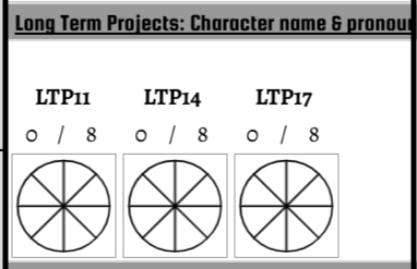
Another thing is that I have not find an ideal way to make clocks for specific characters, such as long time projects. What I did for now is simply create a clock in the general worksheet but add the character name in it. So, it’s like “Rat: Find the Red Sashes’ Leader”. Dunno if there’s a way to improve this.
Thanks! I’ve been thinking about PC-specific clocks a bit and tried two different solutions. Each has pros and cons.
Option 1 is to display charts inside each player’s set of columns and would look like this:
PROS: looks awesome, consistent with the crew-wide clocks elsewhere on the sheet
CONS: They take up a lot of space. If you hide any unused character columns then the charts get thrown off to the side and don’t return when you unhide :(. So you either have to leave empty stuff to the right and ignore the visual clutter OR delete the unused ones and limit what you can do later.
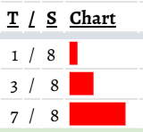
Option 2 is to display the clocks as progress bars like this:
PROS: uses less space, can hide columns without any issues
CONS: Not nearly as cool looking, not consistent with the other clocks on the sheet
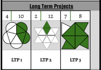
@Rattman, you were right again! I realized there was a way to get the best of both worlds. Heck, there were lots of other advantages that I hadn’t anticipated. The only drawback is the clocks can’t be of ANY size, they have to be one of the defined sizes (4, 6, 8, 10, 12). Version 8.1 has the changes incorporated, as you can see in this screenshot:
And here are full details on the changes in this version:
● Replaces old chart-based clocks with image-based ones. This has several advantages: speeds up the sheet by requiring fewer calculations, uses unique shapes for each type of clock to increase clarity, makes it so you can/group hide rows/columns without fear of charts getting displaced.
● Added more blank clocks to PCs left panel.